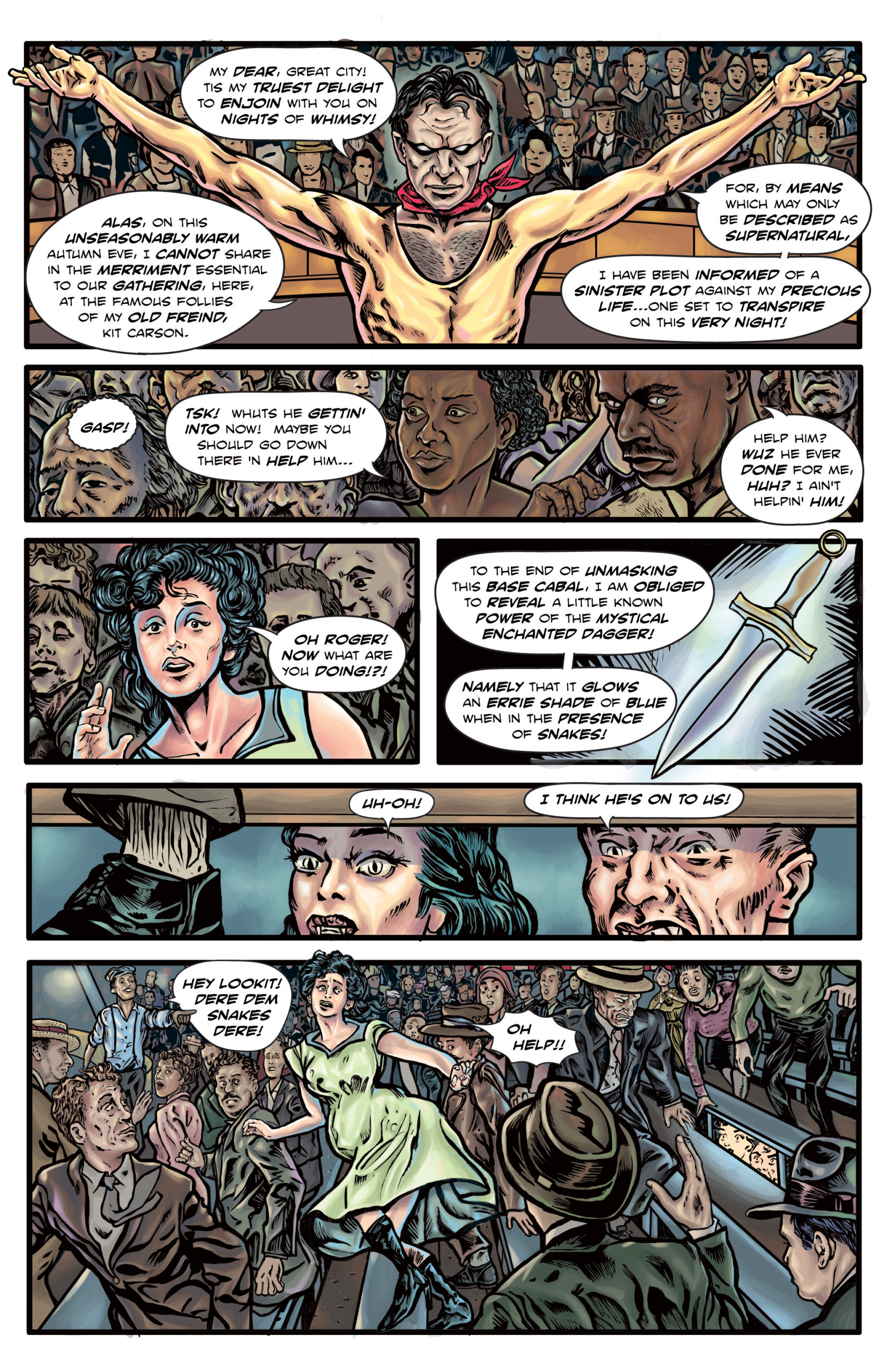
The Enchanted Dagger #5 – Page 11
I’m happy with the top 2/3 of this page. It would have made for a good two page spread but for the pesky bottom panel. I was hoping that once I had given it a full rendering that it would come together somehow, as panels sometimes do. But I think the size of Charlotte in the panel doesn’t have the right proportionality to work with the rest of the composition. A better set up might be to have a closer shot of Charlotte, towards the right of the panel, looking back over her shoulder at the snakes, which would be in a similar viewpoint as the panel above. So another panel redo. As the time between my initial stabs at a given page and its posting here becomes shorter, there will probably be more such panels, which I’ll be sure to point out. Work in progress!
Addendum: I went ahead and resized Charlotte, which I think helps the composition of the page, if not the two page spread. You may have noticed I’ve been using more page bleeds on this issue as a little compensation for the shorter page count, so this pair is inherently unbalanced.

Discussion ¬