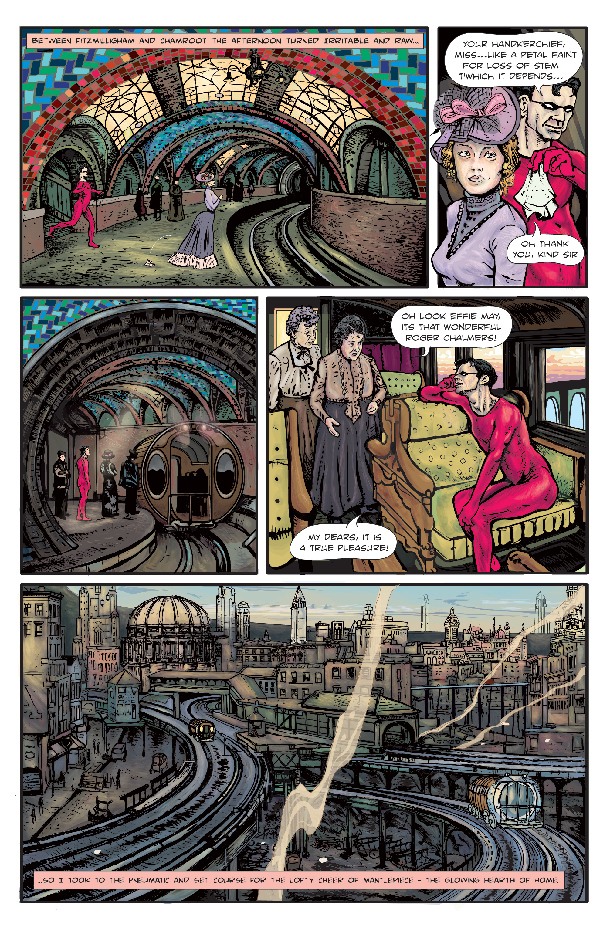
Enchanted Dagger #1 – Page 16
Working in Adobe Illustrator 10, I’ve discovered, has certain appreciable aspects that can be well utilized by the comic book artist. Easy rendering of city-scapes is not readily among these. Adobe Photoshop (the most popular art program used by comic book artists), for those unfamiliar with digital art workings, operates on a large grid where every pixel is available to take on a different color. These pixels can be superimposed on each other as layers – they can also be given different opacities. Illustrator, on the other hand, operates best when using something called “vectors.” Basically “shapes” that can be created as individual, free standing “components” of a drawing, as opposed to an individual, rejustable pixel. These components can likewise be layered and given different opacity. The advantage of a vector component is that it is not bound by the laws of scale and proportion that govern the world of the Photoshop pixel grid. Everybody knows you cant blow up a tiny JPG…it loses its definition. Illustrator vectors, on the other hand are ‘infinitely” rescaleable, resizable and re-adjustable, down to each individual shape. The images that result seem to have a “harder edge” in their line work than the Photoshop drawing but connecting one vector to another is painstaking. It also misses the easy Photoshop gradient blur that is so useful to blend and shade. So it arguably makes for sharp artwork, but does it make for better artwork? No!

I recognize the images you used for reference. I used the same backdrop in panel 1 in a page of C&E: http://chromefetus.thecomicseries.com/comics/87/
Yes! I did notice that a while back…that great subway station…reminds me of Park St in beantown…