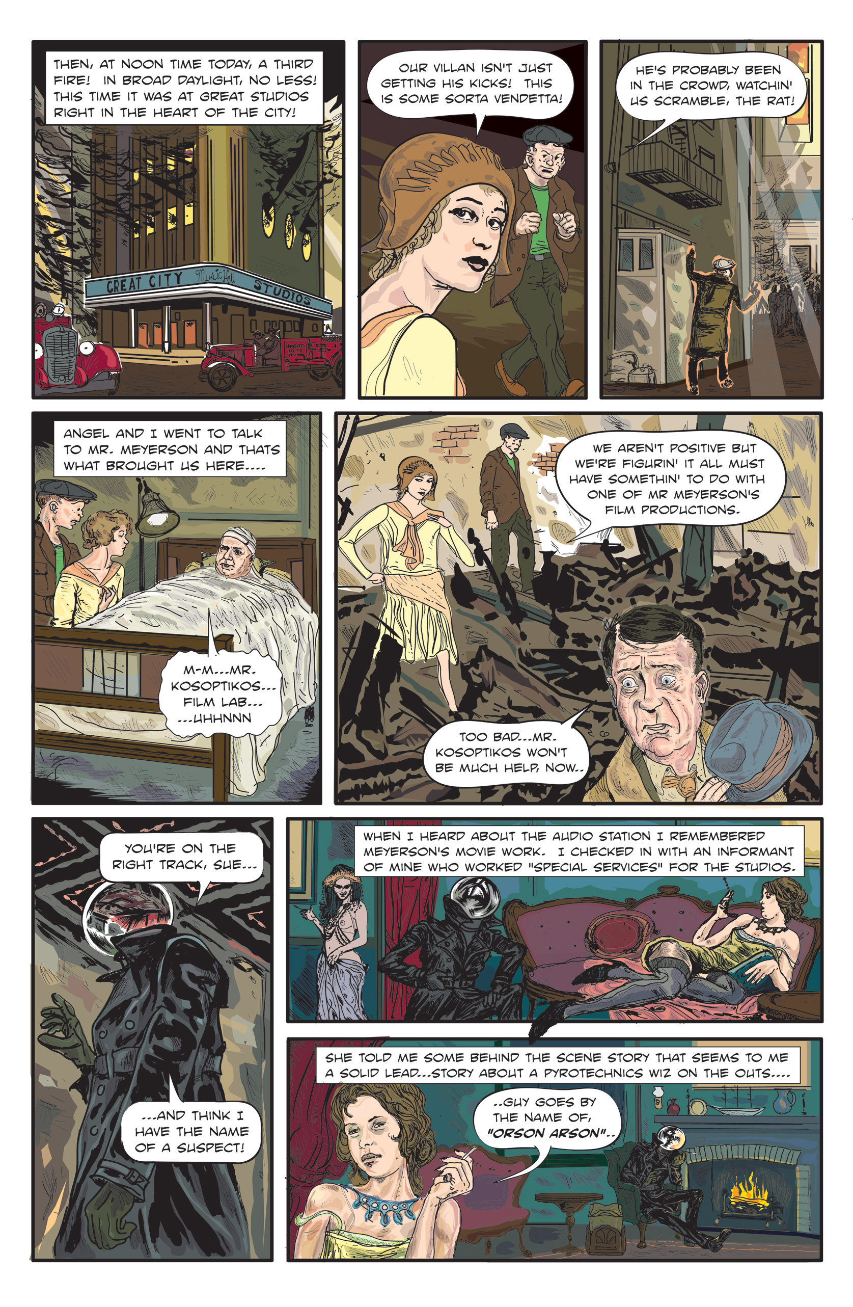
Moon Man – Page 4
Despite its flaws with the line weight and color selection for the Inks (I used a basic “black” as opposed to upping the Cyan/Magenta/Yellow which give a richer color) I was pretty happy with the results. I’m a big fan of Christian Ward’s art on Black Bolt, Greg Tosschino’s work on Low, and Fiona Staples incredible work on Saga. Ward and Toscchino have a style that plays with the color and form in a way that I really appreciate…to the point of abstraction. I’ve always trended towards realism in my art workings. I want the image on the page to look like what I see in my head. Likewise I’ve come to tune what’s in my head to what i think I can produce. These guys (and Stalpes’ back grounds too) are so loose in what they do. This Moon Man stuff was a lot less particular than where I was at with EDag as of the end of issue 3/beginning of issue 4, and there is something about that which appeals to me…but again my degenerate tendencies towards realism always needle in. I’ll be incorporating more photoshop into the art work for issue 5. I’m currently still at 90% illustrator for issue 4…I don’t want to upend the feel of the book too much, for what its worth, but issue 5 will allow for some fresh experimentation. The Circus!

Discussion ¬